Dashboard Overview
The Dashboard is the home screen you land on after signing in to Fyncall. It gives you an at-a-glance view of your business: revenue, orders, customers, conversations, and support health, alongside the status of your connected channels and AI agents.
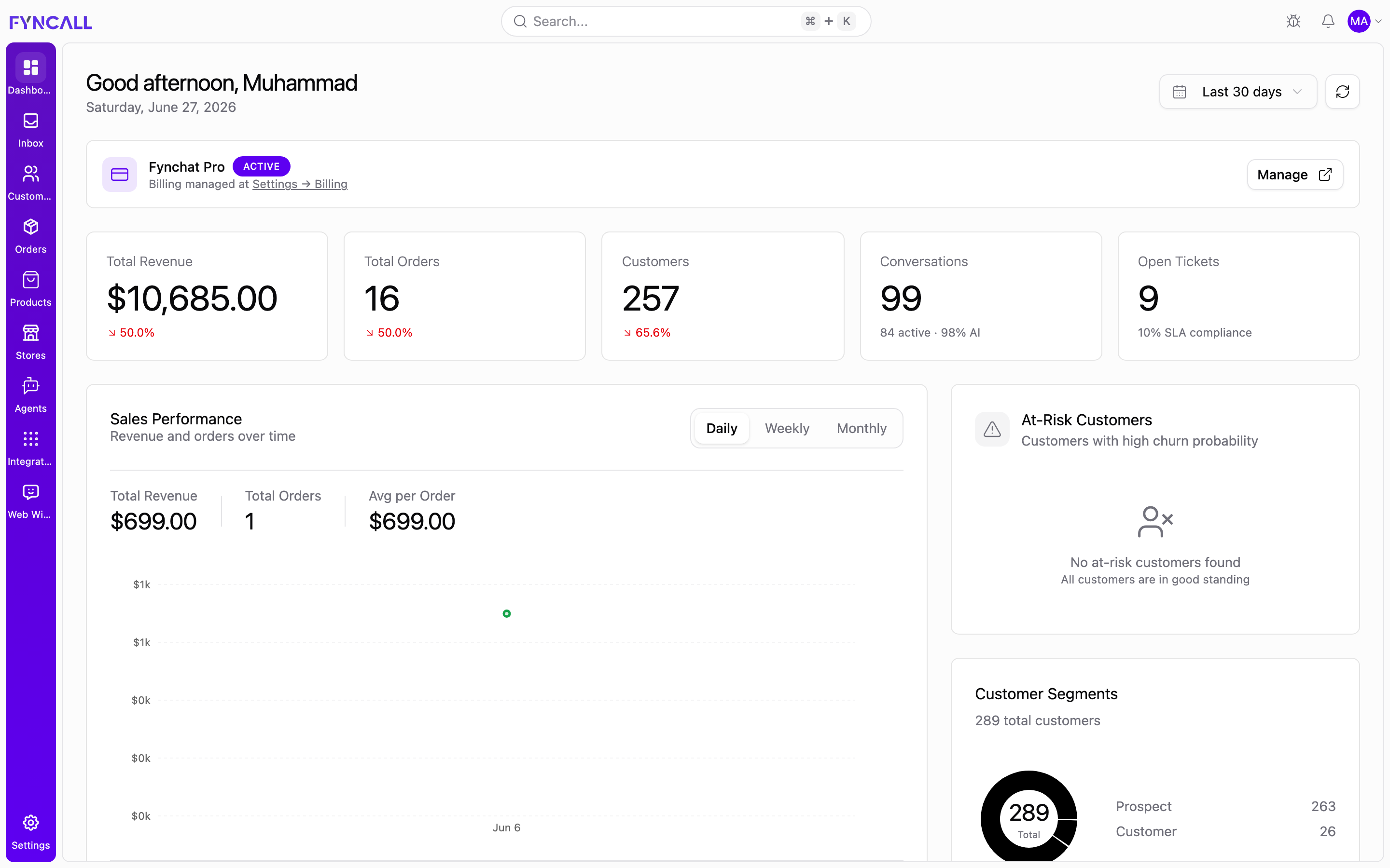
What you see on the home screen depends on your role. Owners, admins, and super admins get the full business dashboard described on this page (revenue, conversion, customer health, and billing). Support agents get a focused workspace centered on their own queue, mentions, and quick actions instead of business-wide analytics.
Layout at a glance
The screen is built from three persistent regions plus the dashboard content:
- Left navigation sidebar — jump between the main areas of Fyncall.
- Top bar — global search, report an issue, notifications, and your account menu.
- Dashboard content — a greeting, plan banner, KPI cards, charts, and customer-health widgets.
- Integrations panel — a status card pinned to the right on wide screens.
Left navigation sidebar
The slim sidebar on the far left is your primary way to move around Fyncall. Hover any icon to see its label. The main items are grouped by purpose, with Settings pinned to the bottom.
| Item | Where it takes you |
|---|---|
| Dashboard | This home screen with business metrics |
| Inbox | Real-time customer conversations across all channels |
| Customers | Customer profiles, history, and segments |
| Orders | Order management and fulfillment |
| Products | Your product catalog |
| Stores | Connected commerce stores (e.g. Shopify) |
| Agents | Configure and manage your AI agents |
| Integrations | Connect messaging channels and other services |
| Web Widget | Set up and customize the website chat widget |
| Settings | Account, team, billing, and configuration |
Some items are only visible to admins and owners. Support agents see a reduced set of navigation items that match their permissions.
Top bar
The bar across the top stays with you on every screen:
| Control | What it does |
|---|---|
| Menu (mobile) | Opens the full navigation drawer on small screens |
| Search | Opens the command palette to jump to customers, orders, and more. Shortcut: ⌘ + K (Mac) / Ctrl + K (Windows) |
| Store switcher | Switch the active store when you have more than one connected |
| Report an issue (bug icon) | Opens a dialog to send the Fyncall team a problem report |
| Notifications (bell) | Shows recent alerts and activity |
| Account menu (your avatar) | Your name and email, language selection, Settings, Report an issue, and Log out |
Dashboard content
Greeting and date
The top of the dashboard greets you by name with a time-of-day message (e.g. "Good afternoon") and shows today's date. On the right are two controls:
- Date range selector — choose the period that drives the metrics: Today, Last 7 days, Last 30 days (default), or Last 90 days.
- Refresh — re-fetches the latest data for the dashboard.
Plan / subscription banner
Owners see a banner showing the current plan (for example, Fynchat Pro) with an ACTIVE status badge. It notes that billing is managed at Settings → Billing and includes a Manage button that opens your billing settings.
If you don't have an active subscription yet, this banner becomes a prompt to set up billing so your AI replies keep flowing.
KPI cards
A row of five key metrics summarizes your business for the selected date range:
| Card | What it shows |
|---|---|
| Total Revenue | Revenue for the period, with a growth indicator vs. the prior period |
| Total Orders | Order count, with a growth indicator |
| Customers | Total customers, with a growth indicator |
| Conversations | Total conversations, with the share handled by AI (and active count when relevant) |
| Open Tickets | Open support tickets, with your SLA compliance rate |
Growth indicators appear as a green up-arrow or red down-arrow with the percentage change.
Sales Performance chart
A trend chart titled Sales Performance plots revenue and orders over time. Use the Daily / Weekly / Monthly toggle to change the granularity. Above the chart, summary figures show Total Revenue, Total Orders, and Avg per Order for the period, and a legend distinguishes the revenue and orders lines.
At-Risk Customers
This widget surfaces customers with a high churn probability so you can reach out before you lose them. Each entry shows the customer's name, a risk-level badge, and a risk score bar. When everyone is in good standing, it shows a friendly "No at-risk customers found" message. A View all customers link jumps to the Customers area.
Customer Segments
A compact donut chart breaks your customer base into lifecycle segments (for example, Prospect and Customer, plus RFM-style segments such as Champions, Loyal Customers, and At Risk when present). The center of the donut shows your total customer count, and a legend lists the top segments with their counts.
Integrations status
On wide screens, an Integrations card is pinned to the right-hand side; on narrower screens it appears further down the page. It shows the live state of your setup:
- Messaging channels — WhatsApp, Twilio, and Instagram, each marked Active or Not connected, with a count of connected channels.
- Active agents — how many AI agents are switched on, listing the first few by name.
- Knowledge Base — the number of knowledge files available to your agents.
If a channel shows Not connected, head to Integrations in the left sidebar to set it up. To add knowledge for your AI, visit Agents.
Real-time and responsive
The dashboard adapts to your screen size — cards and charts reflow into a single column on smaller displays, and the navigation collapses into a drawer on mobile. Use the Refresh button anytime to pull the latest numbers, and adjust the date range to compare different periods.
For deeper workflows, see the dedicated docs for the Inbox, Customers, Orders, Agents, and Integrations areas.